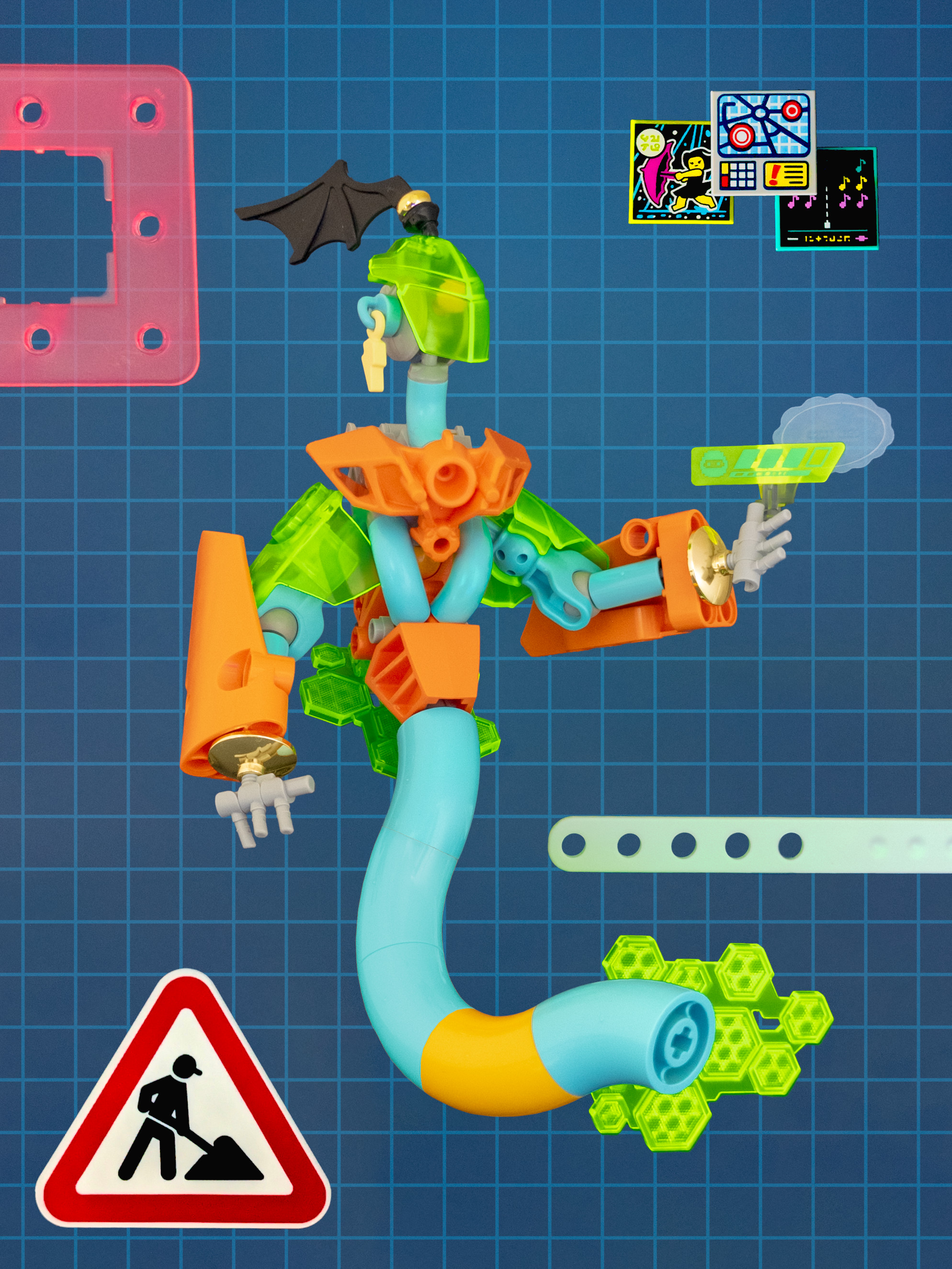
CYBER GENIE // NETWORK DAEMON
Published
Brief
The fifth round theme for RogueOlympics was “wish”/“Wunsch.” This topic has lots of rich interpretations: fairy tales, birthday traditions, playground games, personal desires.
Concepts and research
Wishes are often dangerous, with wish granters making the worst version of a wish come true. A good example is the W. W. Jacobs story “The Monkey’s Paw”. This flavor of wish is interesting to me, and also reminded me of a video adapted from the essay “The Hidden Complexity of Wishes” by Eliezer Yudkowsky (YouTube): In it, wishes are an allegory for controlling a powerful AI and aligning its goals with humanity’s. This idea intrigued me, and would allow me to do a build using a genie as a base for a computer- or software–inspired character.
I did some cursory visual research, but couldn’t find anything close to what I was imagining. The ideas that immediately came to mind were colored by the visual cliché of a blue figure whose lower half is replaced by a tendril of smoke. Looking back, there’s more I could have done to improve the concept at this stage, but I’ll talk about that at the end.
Build
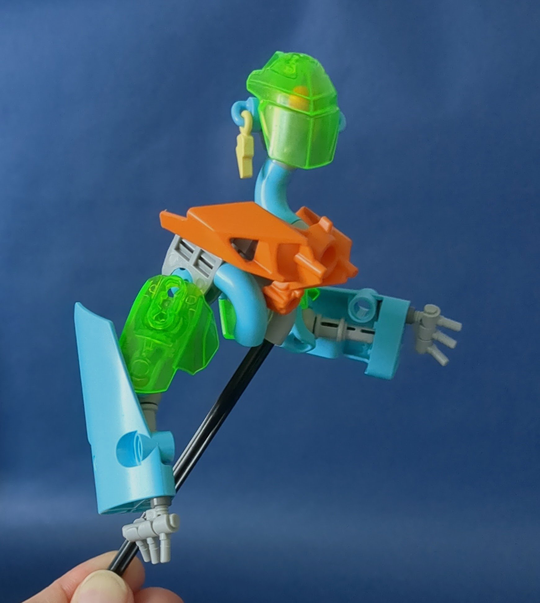
With this idea in mind, I started with a Dots lightning bolt charm? and the tile it connects to. I thought I could use this as an earring (something I saw on a lot of genie representations) and began building out a head to match. For the face, I settled on this design with a Hero Factory visor?, which was reasonably small and simple to fit the part count after being unsatisfied with a few previous iterations. I used a Phantoka mask? as a shoulder decoration and built out arms around it.
It was toward the end of the week, and I was feeling fairly unmotivated with this build. The head design and bright color scheme were both more of an enjoyable tangent from obviously genie-like designs, so it sometimes felt like I was trying to squeeze an unrelated MOC back into my original concept. I reached out to others for feedback, perhaps a little early, but got a couple pieces of concrete advice to implement as I continued experimenting. djok told me to add thumbs (something, embarrassingly, I’ve missed on most of my character builds to date!), and Iggs suggested I move the shoulders up. I eventually found solutions that allowed both, while trying to decide on a direction for the build overall.
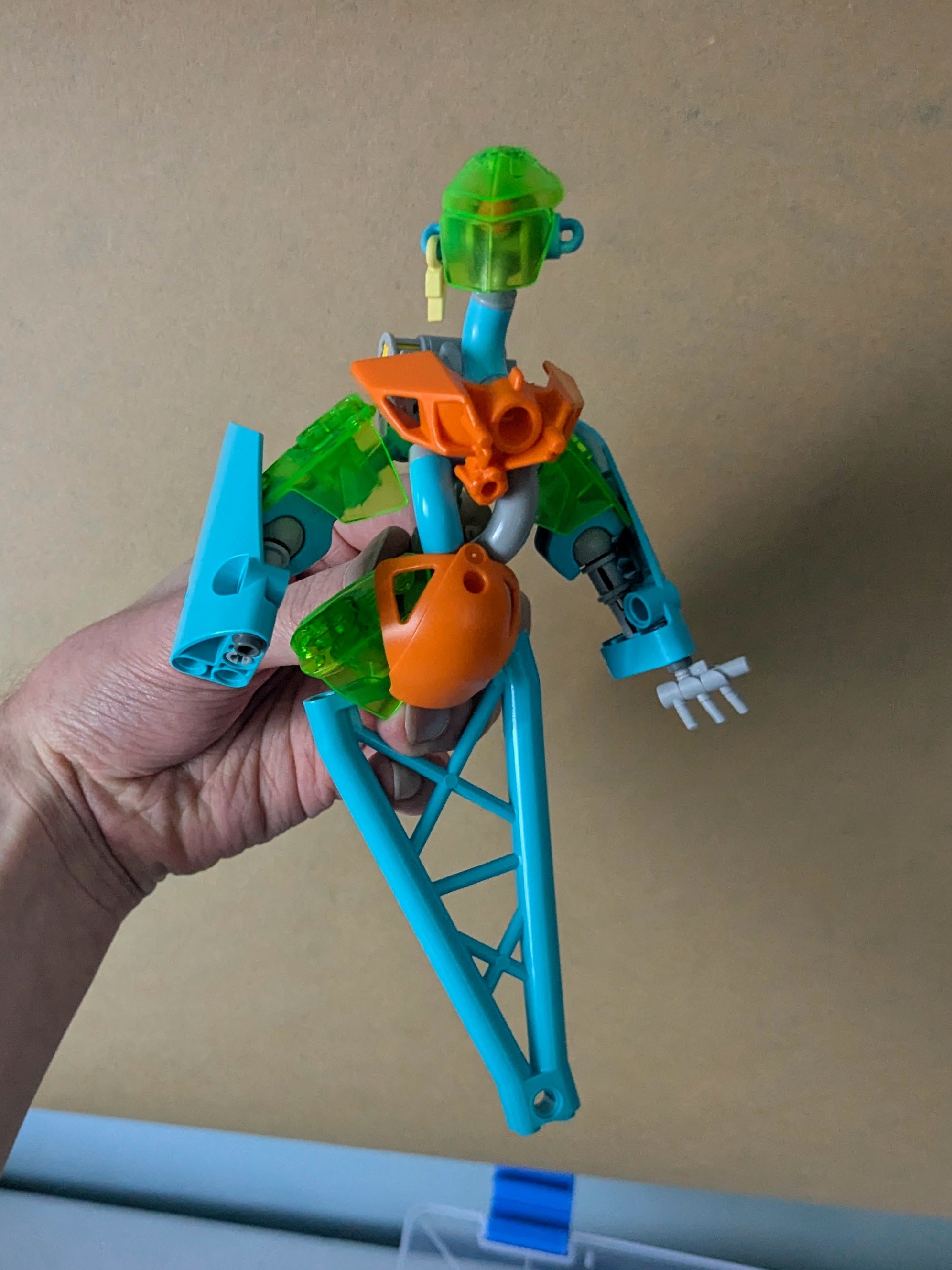
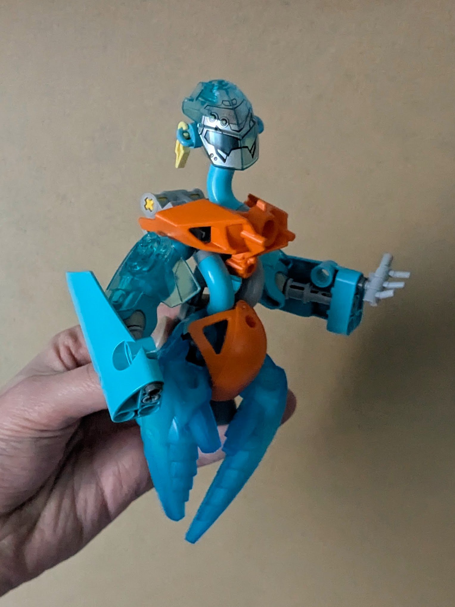
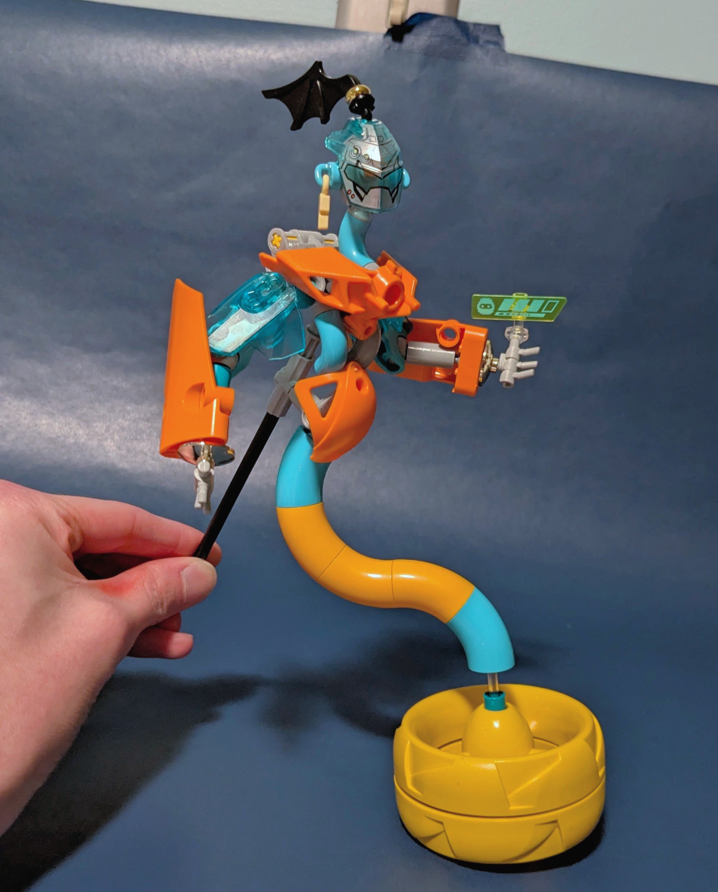
I’ll admit I wasn’t entirely sure what I wanted at this point: to adjust this figure to fit the theme, to jump off in a new direction and skip out on the contest for the week, or to set the build aside entirely. I ultimately decided to stick with the original brief and finish something, then try to review my work with fresh eyes and look to improve next time.
Presentation
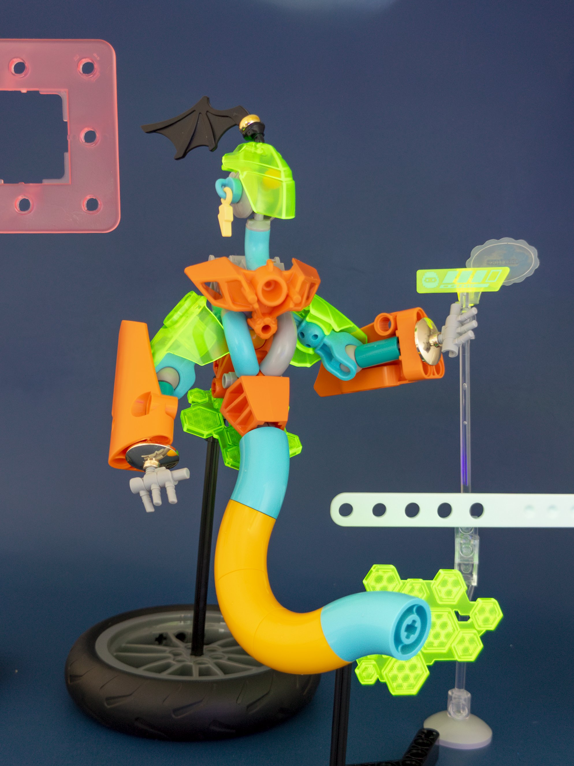
Finishing the build about four hours before the RogueOlympics deadline, I took a risk to take photos and start editing before I’d counted the parts. As I was iterating, I found that abstract frames, like application windows, helped the figure feel more in place. I got these placed into the shot in-camera, something I’ve tried to do for all my builds for this contest.
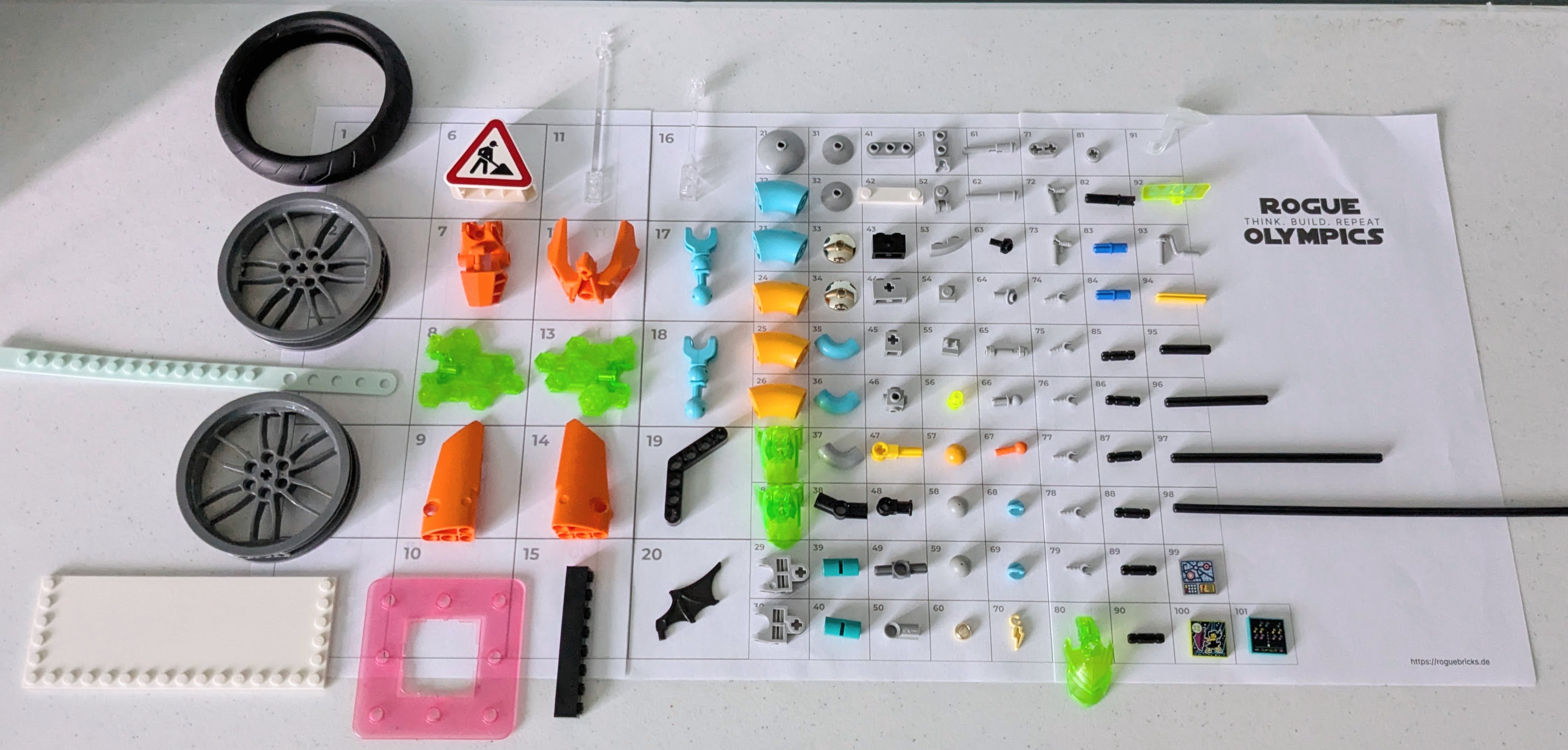
The edit also required recoloring a few Technic connectors to medium azure. With the clock ticking down, I almost panicked when the bright light orange pieces resisted efforts to match with the neighboring tubes in the tail. If you’re in a similar situation, don’t forget to check saturation!
Reflections
It was a rush, but I was done. With everything submitted and the final photo as polished as I could make it, I was able to better evaluate what I’d done as I began writing this post.
The cyberpunk styling and genie/djinn subject still feel like they’re fighting against each other, even with the maximalist presentation masking this somewhat. Curious how I might better meld these aesthetics, I thought about my visual research process again. I realized I’d limited myself to searching for the exact subject I was trying to create with keywords like “cyber genie.” And despite seeing more animalistic depictions of djinni in historical illustrations, my mental image was still fixed on the Disney-eqsue blue version—making me wonder why the Genie in Aladdin was blue to begin with. According to two people involved in the movie, it was to visually distinguish good and bad guys, with some inspiration drawn from the striking blues in Persian art and architecture (source: Smithsonian Magazine). Knowing this, my use of medium azure felt disconnected from more authentic source material, as well as the darker side of wishing that had inspired the build. While I think a more familiar depiction of a genie (at least for a Western audience) could be appropriate to help make this part of the concept read clearly, in this model it still felt out of place, as does the braid—a late addition when I felt the “cyber” was overwhelming the “genie.” That could have been an early sign that the concept wasn’t coming together as planned.
Unsatisfied, I went back to search for more visual references. This time, I searched more broadly, looking for fusions of fantasy and technology in a range of other forms: urban fantasy, golems, artificers. I was especially struck by the this This Is How You Lose the Time War fanart, where the red figure’s arms evoke both carved ivory and futuristic composite materials. I could imagine a similar idea that sits somewhere between a printed circuit and intricate tilework, or the smoke and wild energy of traditional djinn depictions infused with electric energy.
Details like this could help me make more intentional choices for materials and textures if I return to this build later. One approach to this is color-texture-material consistency, where each material uses a color and texture that are not used elsewhere in a model. In this build, jewelry and ornaments are mostly chrome gold and round, but occasionally yellow or angular like the lightning bolt. The trans. bright green has a consistent texture, but its material quality and meaning are poorly defined. I think the orange is the most successful, but still feels like it doesn’t quite fit into the fabric of the build as a whole. Starting again, I might hold onto the orange elements if I kept the same scale, but try alternatives for the other color or material layers—perhaps something darker that evokes uncertainty or unpredictability. I’ve made color swatches for other builds in the past, so I might extend that to make material swatches to help develop a more cohesive palette.
What I learned:
- Interrogate visual clichés and decide if they add to a build.
- Make lateral moves in visual research.
- Seek meaningful color-texture groupings.
I debated scrapping this design multiple times toward the end, but I’m glad I finished it. I feel I’ve been able to better identify the off-putting flaws when looking at the completed figure in context. I’m sure that there will be times when, despite sunk cost, it’s better to start over or abandon a project. Still, it can be hard to keep perfectionism out of my hobby time, and this process of recording and dissecting my work gives me more confidence I can still learn from the builds that I’m less happy with.