Katzenschreiben
Published
Brief
The second round theme for RogueOlympics was “Oops”/“Ups.” I felt that the most successful part of my first entry was that it told a story—that there were multiple players and clear tension. I wanted to carry this forward and focus on clear visual storytelling, something that would challenge my existing presentation workflow.
Concepts
First, I imagined someone distracted, about to walk into an open manhole cover—something like the inciting scene of Soul where Joe’s spirit is knocked out of his body (clip: Joe’s Accident – YouTube). I was worried this kind of scene would have the potential to look fairly static in minifigure scale, losing a lot of the motion and drama that makes this clip memorable. However, a more dynamic brick-built or constraction figure would take up a larger amount of the piece count and make it hard to make an immersive scene. Another idea was a bike stranded in wet cement with tracks leading away. But for this round, I ultimately decided to draw inspiration from something familiar.
Build
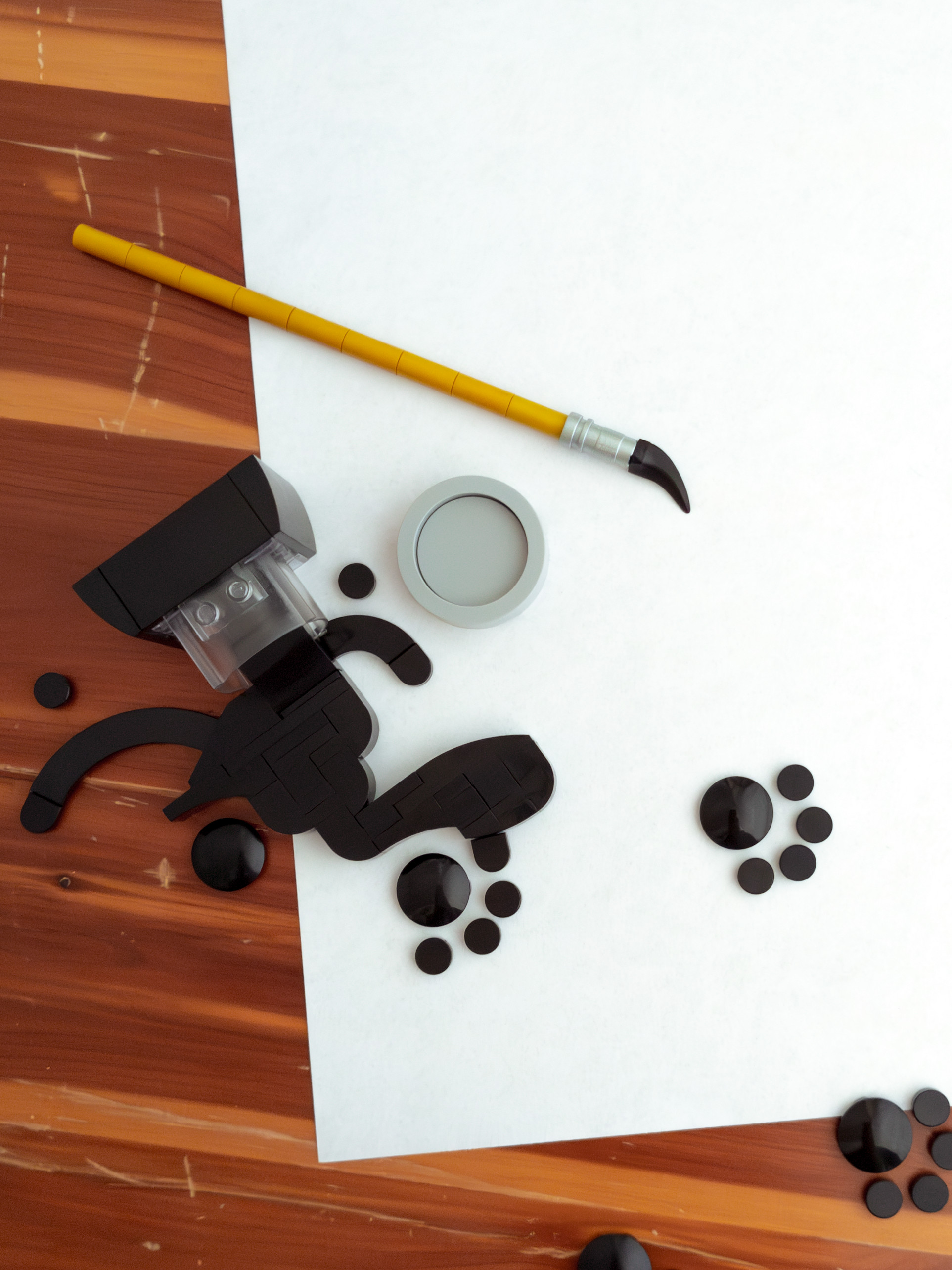
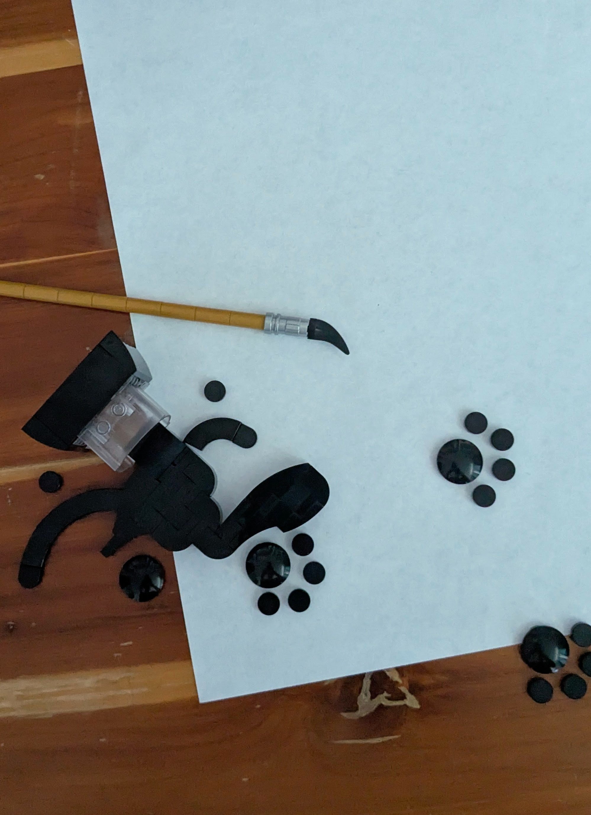
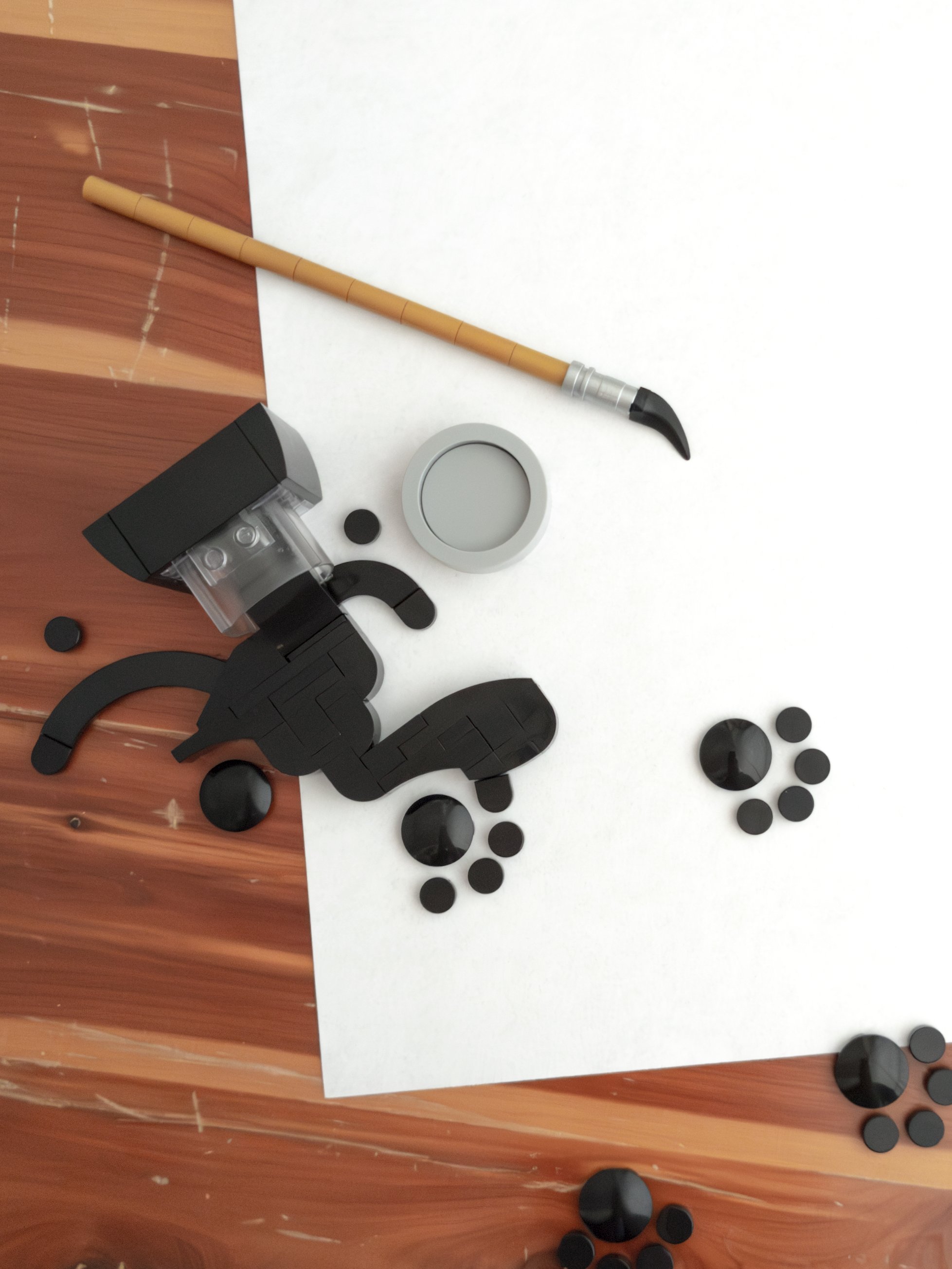
I had the idea of a simple pawprint in ink, using a boat stud? to capture the rounded, glossy surface of a large ink drop. The rest of the model developed from there.
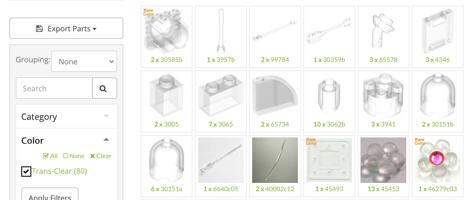
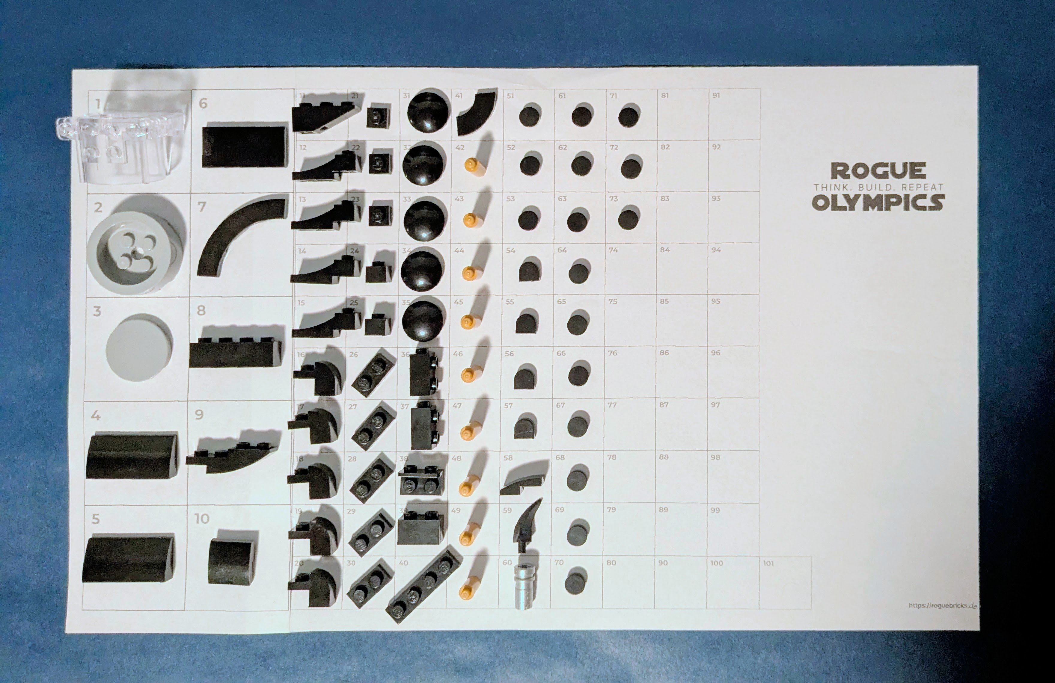
I often use Rebrickable while building to help identify parts in specific colors or functions. I knew I wanted a clear inkpot, and quickly identified the Life on Mars/Mars Mission tube connector?, which otherwise hadn’t come to mind.
I briefly tested the idea of an interrupted portrait or sorts.
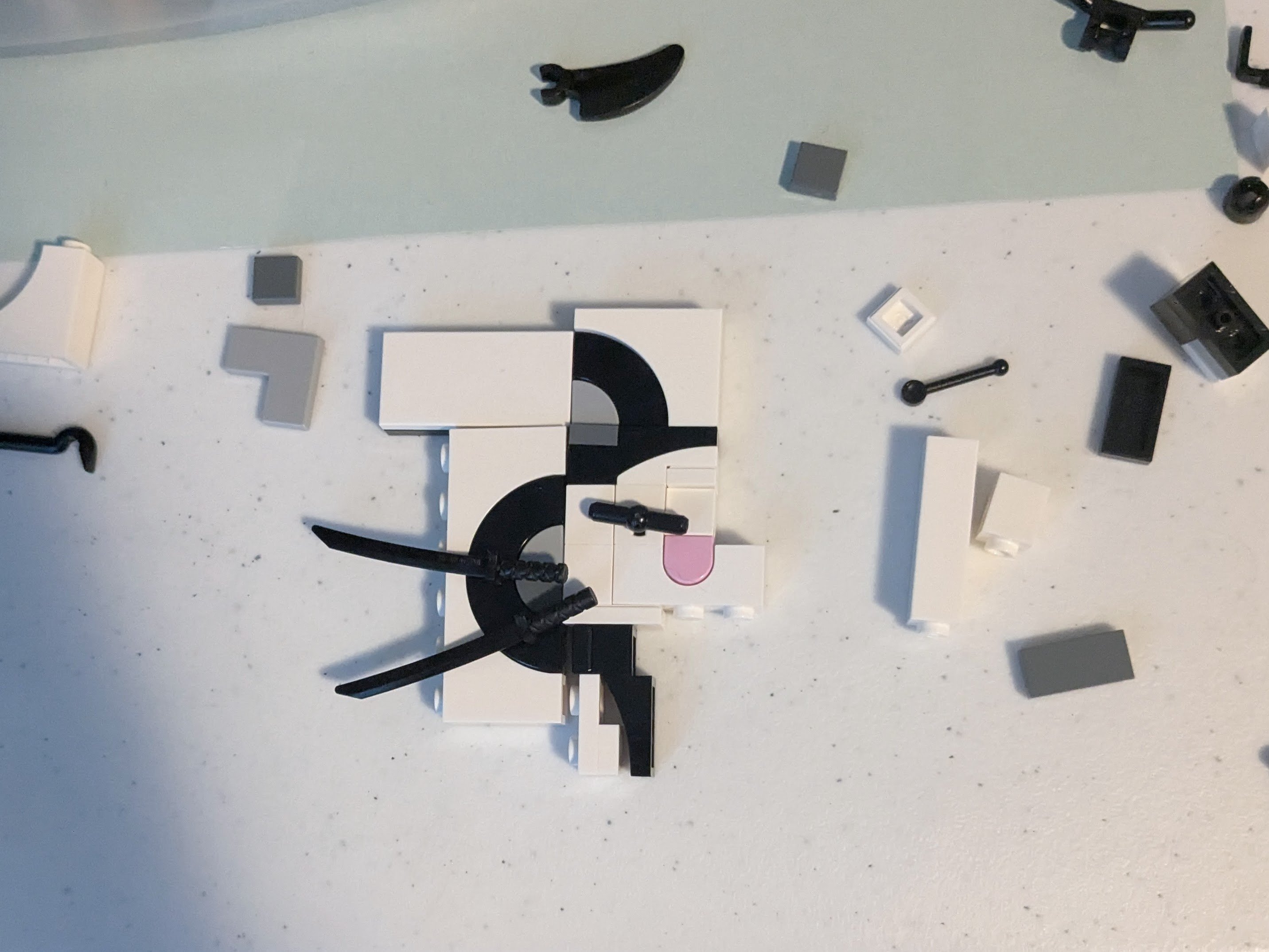
However, the limited white arches in my collection made it challenging to create a natural cat face, and I suspected that the 1-stud thick “paper” would break the illusion. Ultimately, the story I was trying to tell only needed a few elements: artists’ tools, traces of an interloper, and a clean background to present them against. An unfinished composition on that background would add to the story—possibly indicating more about the relationship between the artist and cat—but it isn’t necessary to get the core idea across.
Presentation
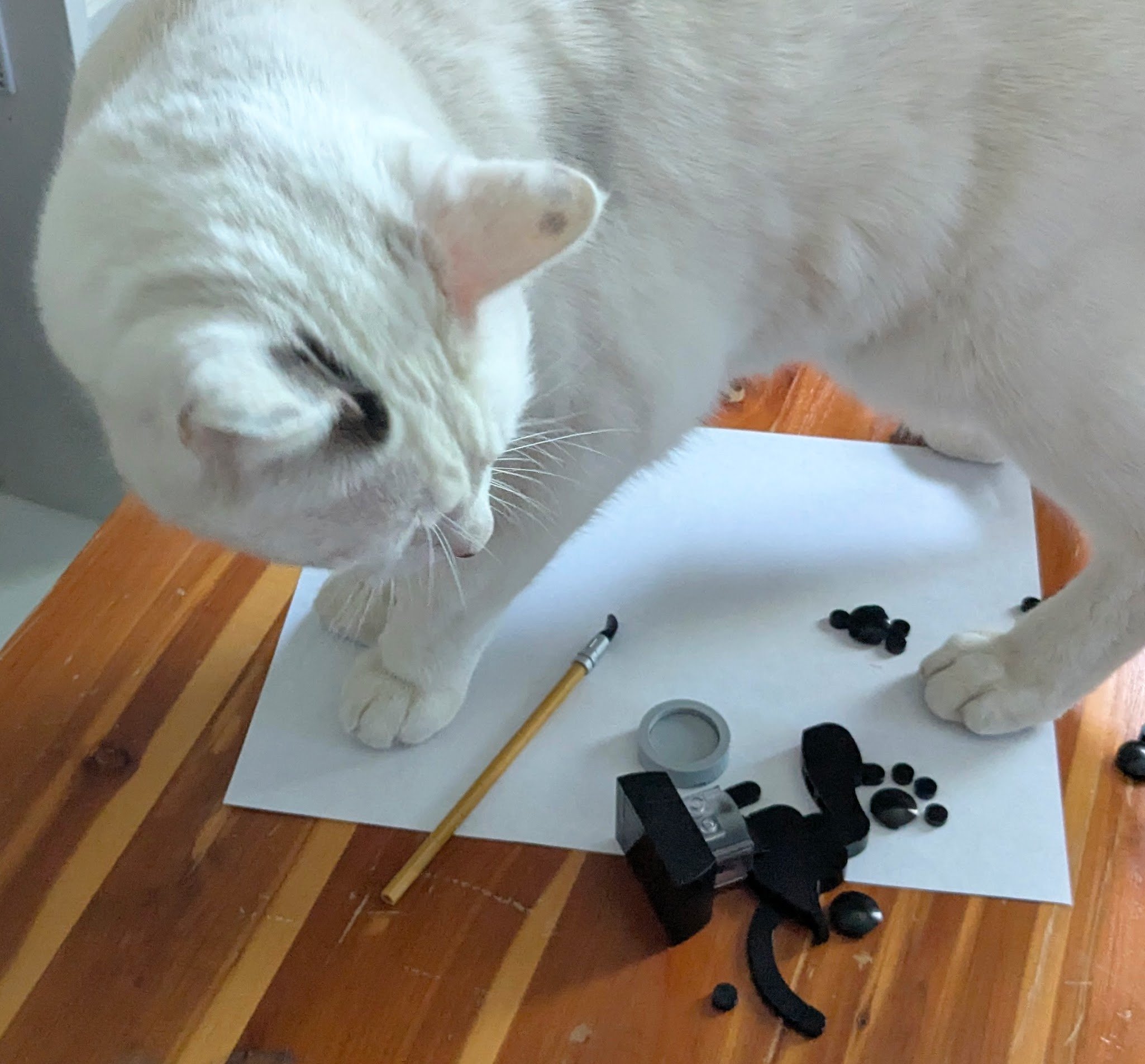
I take most of my photos indoors with natural light, but even on an overcast day there are directional shadows due to light entering my workspace from two windows on adjacent walls. Even with ideal conditions, I was unhappy with the shadows cast on the white paper by the pieces making up the ink. (A harsher example under overhead light is visible in the picture above.) To soften the shadows, I set up a makeshift lightbox using wire and paper.
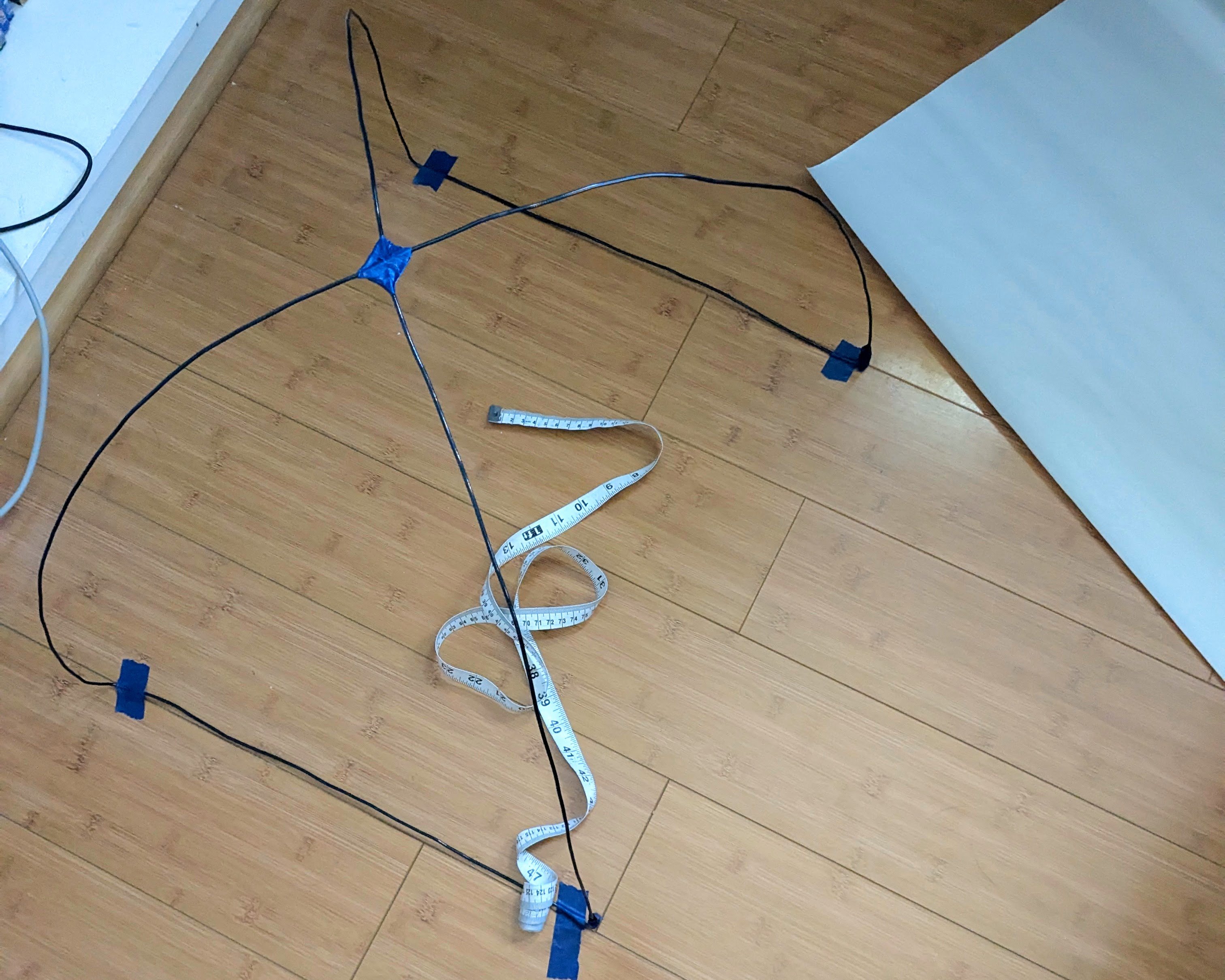
I set up the lightbox with the paper aligned with the window with the brightest light (the other, smaller window has a sheer curtain which makes its light fairly diffuse by default), which was enough to cancel out the hard shadows while still allowing some light to filter through. I often resort to taking photos with one or both of the windows mostly covered to limit shadows, but this limits the hours during the day when there’s adequate light for use with my phone camera. This allowed me to let more light into the room while retaining a diffuse quality, making it easier to get a clean photo.
Reflections
What I learned:
- Using a lightbox provides more flexibility when using natural light indoors and softens shadows for enhanced visual clarity with small elements.
- A lightbox only needs to address the direction of the harshest light source to have a noticeable effect, so even a crude design can be enough to improve presentation if tailored to a room’s lighting conditions.
While I plan to improve the lightbox a bit, it allowed me to enhance the simplicity and cleanliness of the scene, which I think soundly speaks for itself. It also gave me a lot more flexibility with the kinds of lighting conditions I could use, especially for a model like this that benefitted from fewer shadows and reflections. This is something I anticipate using a lot for future projects, and which should remove some of the frustrations I’ve had with my photo setup.
For anyone else interested in cleaning up their photo setup, I encourage you to try out something similar and compare the results!
